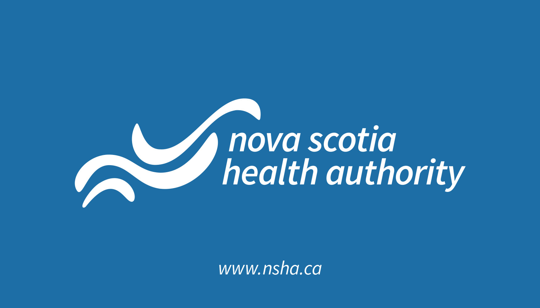


On April 1st 2015, Nova Scotia created a new provincial health authority to replace to previous nine district health authorities. The challenge here was to create a cohesive visual identity and brand architecture that could unite the province under a single, more efficient system, producing greater health outcomes for the future. Inspired by the waves that surround the province, the new visual identity became a symbol that all Nova Scotians could identify with no matter where they lived in the province. The three waves represent three levels of impact the health authority will have – on individuals, their communities and the province as a whole. Various templates for forms, appointment cards, ads and brochures along with a brand standards manual were also created to help roll out the new brand at all levels.